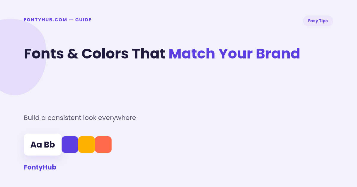
Picking fonts and colors that match your brand is one of the fastest ways to make a business look established, even before it actually is. The right combination signals personality and professionalism at a glance — and getting there doesn’t require a design background.
Table of Contents
- Why Fonts and Colors Shape First Impressions
- How to Choose Colors That Match Your Brand
- How to Choose Fonts That Match Your Brand
- Pairing Fonts and Colors Together
- Free Tools to Help
- FAQ
Why Fonts and Colors Shape First Impressions
Before a visitor reads a single word, color and typography have already communicated something — trustworthy, playful, premium, budget-friendly. That’s why fonts and colors that match your brand aren’t just decoration; they’re doing real communication work, often faster than your actual content can.
How to Choose Colors That Match Your Brand
Start with the feeling you want your brand to communicate: calm and trustworthy often points toward blues and greens, energetic and bold points toward reds and oranges, premium and minimal points toward black, white, and a single accent color. Pick one dominant color, one secondary color, and one accent — following a simple 60-30-10 ratio keeps the palette from feeling chaotic. Free tools like Coolors or Adobe Color can generate matching palettes instantly if you’re starting from scratch.
How to Choose Fonts That Match Your Brand
Fonts generally fall into a few personality categories: bold sans-serifs feel modern and confident, serif fonts feel traditional and trustworthy, script fonts feel personal and creative, and monospace fonts feel technical or minimal. Pick one font for headings and one simpler font for body text — using more than two fonts usually makes a brand feel inconsistent rather than intentional. If you want to preview stylized text options quickly, a free tool like FontyHub’s Cool Font Generator lets you see multiple font styles applied to your actual brand name instantly.
Pairing Fonts and Colors Together
The goal is for your fonts and colors that match your brand to feel like they belong to the same personality. A playful, rounded font paired with muted corporate blues can feel mismatched, while the same font paired with warm, energetic colors feels cohesive. A simple test: imagine your brand as a person — would this typeface and this color palette both describe the same personality? If not, it’s worth adjusting one side.
Free Tools to Help
Google Fonts offers a huge free library organized by style and mood. Coolors and Adobe Color handle palette generation. Canva lets you preview font and color combinations directly on real templates, which is often more useful than looking at swatches and type samples in isolation.
Testing Whether Your Choices Actually Work
Once you’ve picked a direction, it helps to actually test whether your fonts and colors that match your brand hold up outside of a mockup. Apply them to a real social media post, a business card, and a website header, then step back and look with fresh eyes — or better, ask someone unfamiliar with the project what feeling they get from it. If the answer doesn’t match the personality you were going for, that’s a sign to revisit either the font, the color, or both before rolling them out everywhere.
It also helps to check your fonts and colors that match your brand at different sizes and on different backgrounds. A palette that looks great on a white background might feel flat on a photo overlay, and a font that reads clearly at large sizes might become hard to read in a small mobile menu. Testing early avoids having to redo brand assets later once they’re already in wide use.
FAQ
How many fonts should a brand use?
Two is usually the sweet spot — one for headings, one for body text — though a single well-chosen font can also work for very minimal brands.
Do brand colors need to follow color psychology exactly?
Not strictly — color psychology is a helpful starting point, but industry norms and personal preference matter too, as long as the final palette feels consistent.
Can I change my brand’s fonts and colors later?
Yes, though frequent changes can confuse an audience that’s just starting to recognize you — it’s best to commit to a direction for at least several months.
What if my favorite font and color don’t seem to go together?
Try adjusting the shade or saturation of the color rather than abandoning either choice — often a slightly different tone bridges the gap.
Want to preview fonts on your actual brand name? Try the Cool Font Generator to see stylized options instantly.
For deeper guidance on brand identity systems, AIGA’s design resources offer free articles written by professional designers.
Interested in contributing? Write for us and get featured on FontyHub with a dofollow backlink.